
The Top 10 Chart Patterns of All Time

As you know by now, I’m a big believer in using chart patterns to get results. They are a visual representation of human emotion in the market – fear and greed. And humans behave in repeatable patterns that we can see by using charts.
My goal is to make sure you have the tools so that you can trade like a champion.
With that in mind, I want to provide you with the 10 most effective chart patterns top champions use in trading.
These chart patterns can help you understand the best times to buy stocks… when to sell… and conditions where you should be patient.
Once you are able to recognize and trade these patterns, you’ll quickly be able to boost your returns.
So let’s add some chart pattern tools to your investing “toolbox.”
Pattern No. 1: Ascending Profit Channel
This chart pattern is hands down my personal favorite.
The “Profit Channel”…
This chart pattern is responsible for helping me collect the biggest individual wins I’ve recommended over the past year.
One of the things that I really like about Profit Channels is that they can be traded successfully in virtually any market.
And it’s not just me who really likes Profit Channels… They’re a favorite of chart pattern traders.
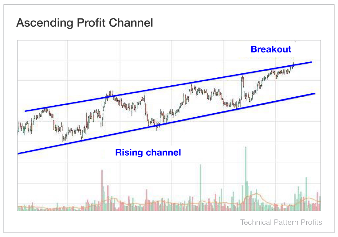
- A Profit Channel is formed by two positive-sloping trend lines – one following higher lows and one following higher highs.
- A breakout above the upper trend line signals a move higher, while a breakdown below the lower trend line can indicate a move lower and/or a possible trend change.
- Traders can also attempt to swing trade between the support and resistance levels of the channel.
Pattern No. 2: The Bull Flag
With that in mind, let’s jump to the next chart pattern you must know.
It’s the one that I refer to as the “World Record Pattern.”
That is, of course, the bull flag pattern.
In the Encyclopedia of Chart Patterns, the bull flag pattern is ranked No. 1 for signaling when a stock is set to take off…
The breakout from a flag often results in a powerful move higher because it indicates that bullish investors were buying during the consolidation. Despite the stock breaking through the upper resistance level of the flag, bullish investors are still snapping up shares, creating a strong upward move.
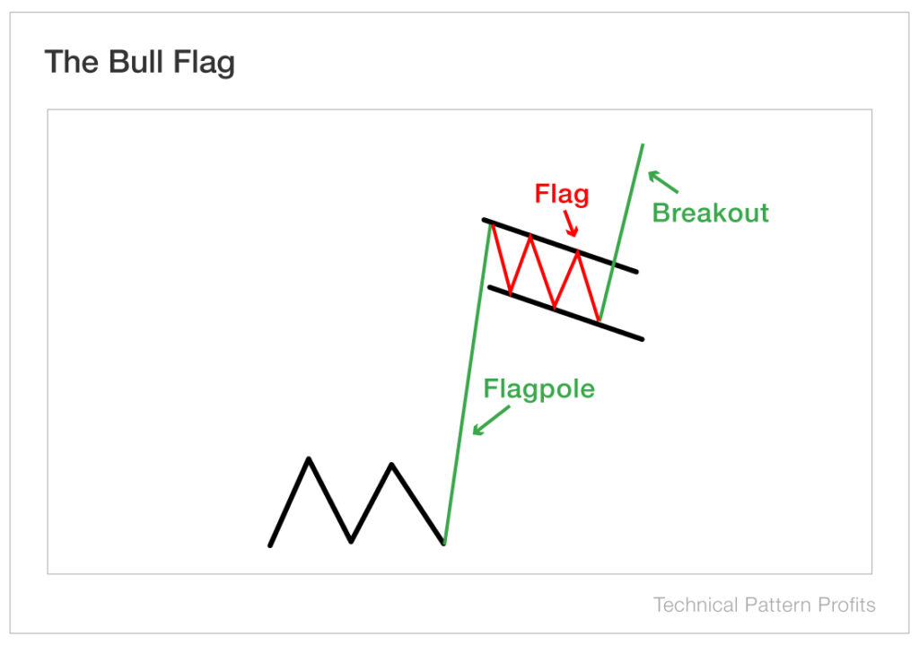
- A bull flag pattern is a trend continuation pattern that is seen when a stock has a strong vertical rally (the flagpole) followed by a period of consolidation and market indecisiveness (the flag).
- Despite a sharp rise in the stock, the stock refuses to drop to its previous levels as bullish investors continue buying shares.
- When the stock breaks through the resistance level, it indicates the stock price should rise. (A tighter flag means a better signal.)
Pattern No. 3: Head and Shoulders
Our next pattern is a little bit different from our World Record Pattern, the bull flag.
But it’s another very important technical indicator – the head and shoulders pattern. It’s what I refer to as the “Old Reliable Pattern.”
I call it “Old Reliable” because it is hands-down one of the most consistent and easy-to-spot patterns you can learn.
This pattern can lead you to big profits…
But it’s most effective as a tool that tells you when to get out of stocks that you own or when to short a stock… just before a significant drop.
The Encyclopedia of Chart Patterns ranked it No. 1 for telling you when a stock is going to decline.
The illustration below represents a bearish head and shoulders pattern where the stock reaches three distinct highs following an uptrend, with the middle peak being the highest.
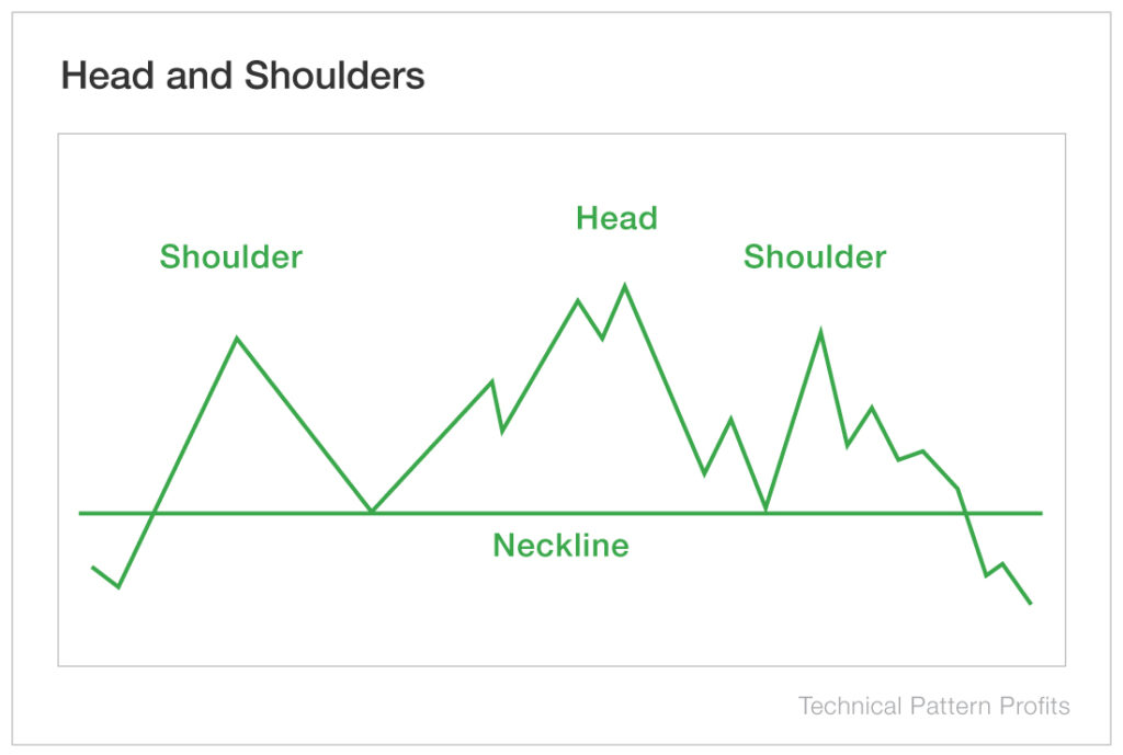
- After a long bullish trend, the price rises to a peak and subsequently declines to form a trough.
- The price rises again to form a second high above the initial peak and then declines again, preferably on lower volume, signaling that although the price is higher, there is less conviction from bulls.
- The price rises a third time, but to a lower peak than the second. Volume should be lower than the earlier peaks, signaling that the buyers are exhausted.
- If the selling pressure drives the price down through the neckline, this indicates that bearish sellers have taken over and the stock is in for a fall.
An inverse head and shoulders pattern is the exact opposite of the above illustration and examples. When the price rises above the resistance of the neckline, a reversal of the downtrend has occurred and a new bullish trend is getting underway.
Pattern No. 4: Cup and Handle
Just as the name implies, this technical chart pattern resembles a cup and handle and is considered a bullish signal.
Traders using this pattern should aim to identify the initial formation of the handle and open a position when the price breaks out above the recently established resistance level.
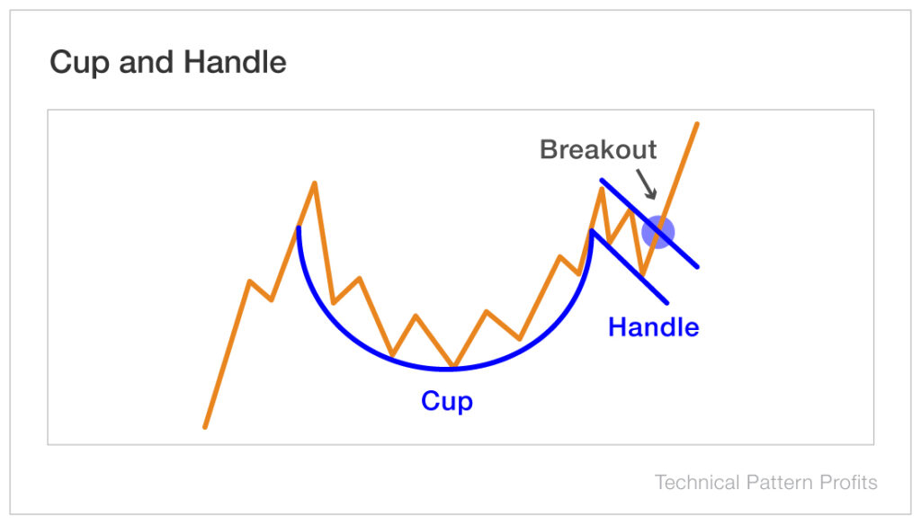
- This pattern is formed following a new high, during an uptrend of the stock. It resembles a “U” shape.
- Upon reaching another high, the price will retract, or consolidate, forming the handle.
- When the “U” shape breaks out of the resistance level created in the handle, it signals a move higher.
Patterns No. 5 and No. 6: Double Top and Double Bottom
Double top and double bottom patterns reflect the same trend in opposite directions.
A double top pattern has an “M” shape and is an extremely bearish technical signal.
A double bottom pattern has a “W” shape and is a bullish technical signal.
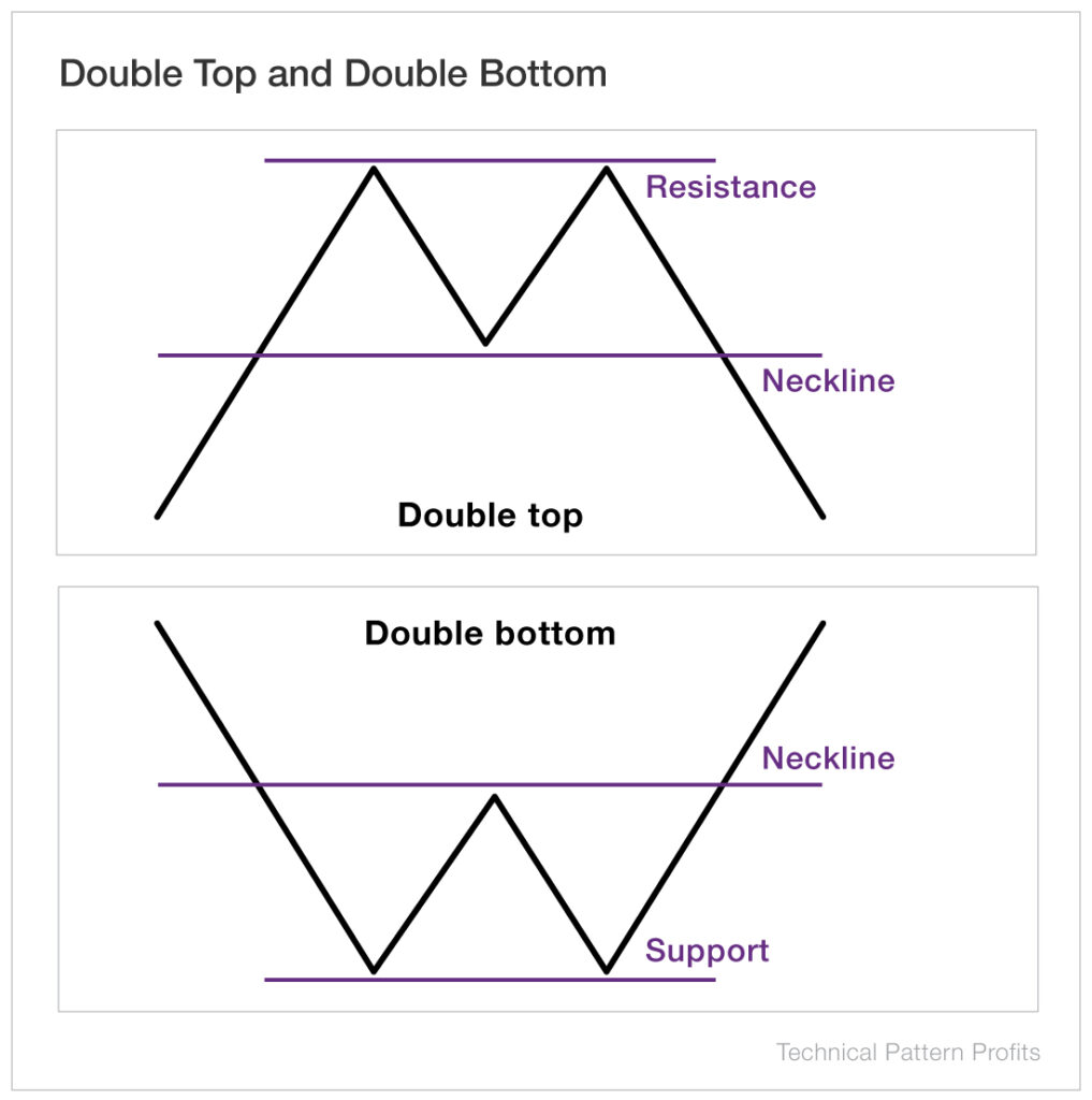
- With a double top, an asset reaches a high price (the resistance level) two times with a decline in between.
- After reaching the high for the second time, the trend reverses and is confirmed when the price crosses through the neckline from the new highs.
- With a double bottom, an asset drops to a low price and then a moderate rally brings the price back up before it falls back to the previous low price.
- The pattern is confirmed when the price rebounds off the bottom support and breaks through the neckline established by the moderate rally between lows.
Pattern No. 7: Rectangle
A rectangle pattern is formed when a stock’s price is consolidated and moving between horizontal support and resistance levels.
A rectangle will often occur within an uptrend or downtrend. The stock “pauses” and trades sideways for some period of time.

- This pattern indicates that there is no significant trend while the price fluctuates within these levels. There is an even battle between buyers and sellers.
- If the stock breaks out above the resistance level, it is an indication that buyers are outnumbering sellers and the price will rise. The opposite is true if it breaks below support.
- A rectangle is often (though not always) a continuation pattern, meaning the rectangle represents a pause before the stock price continues in the same direction that it was moving before it entered the pattern.
- If the price fluctuations within the rectangle are significant, you can trade within the rectangle by buying at the support line and selling at the resistance line. However, waiting for breakouts above resistance or below support offers the best opportunities for traders.
Pattern No. 8: Ascending Triangle
This pattern is formed when an uptrend leads to a high and consolidates only to bounce back and reach that previous high again.
The higher resistance trend line is established once there are two highs at roughly the same levels. The lower support trend line is established after two higher lows.
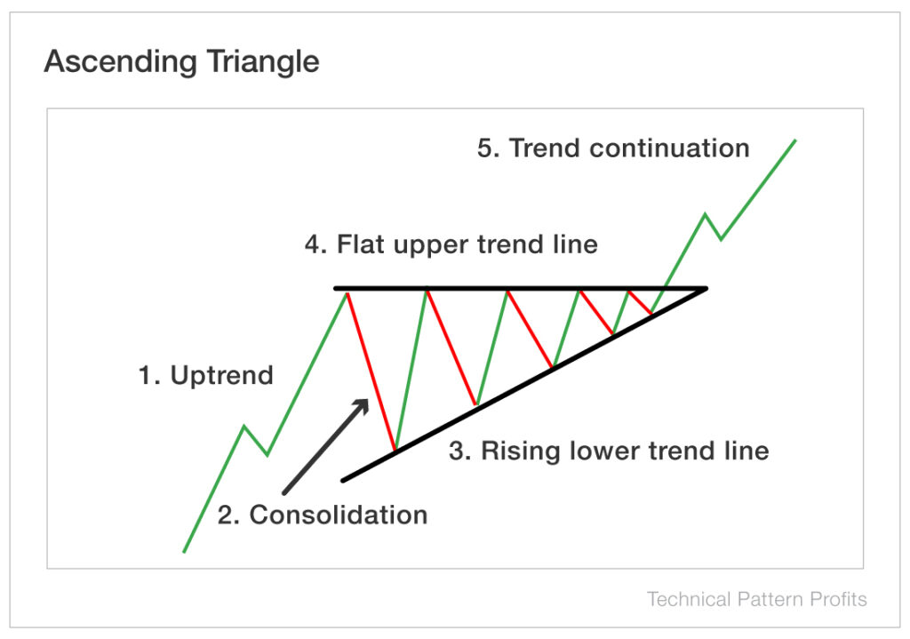
- A breakout above the resistance level indicates a continuation pattern and shows that the price is likely to rise.
- A breakdown below the support level of the triangle indicates a discontinuation of the pattern and shows that the price is likely to fall.
Pattern No. 9: Diamond Bottom
The diamond bottom pattern is formed through an uneven head and shoulders pattern in which the peaks and troughs are connected in the shape of a diamond.
This pattern often occurs at the bottom of downtrends and signals an upcoming breakout from the recently established resistance.
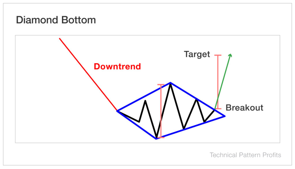
- If the stock price crosses below the support level, it will likely fall further. If the stock price crosses up through the resistance level, the price will likely continue to rise.
- When a trading session closes above the resistance level, it signals bullish momentum and suggests that the price will be pushed higher.
Pattern No. 10: Symmetrical Triangle
A symmetrical triangle pattern is formed by converging support and resistance levels.
A symmetrical triangle occurs when a stock’s price is consolidating in a way that creates two converging trend lines with similar slopes.
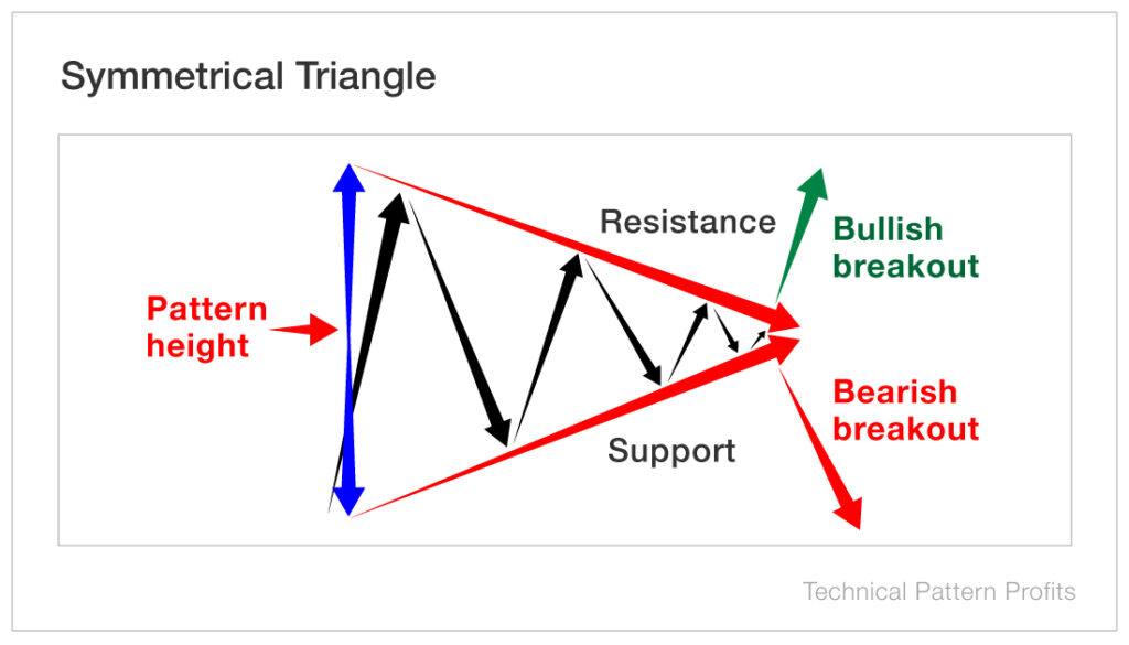
- The highs are lower and the lows are higher, causing the convergence of trend lines.
- The price movement between trend lines narrows as the volume declines.
- A breakout to the upside suggests a bullish move. A breakdown below the triangle suggests a price decline.
Generally, you want to see the stock break out about two-thirds of the way into the triangle. If it makes it all the way to the point of the triangle, the likelihood of a successful breakout is reduced.
Start Trading Like a Champion
You can go down a rabbit hole with technical analysis. You can make it quite complicated… but there’s no need to.
Simply being on the lookout for these 10 chart patterns can help you make better trading decisions.
Identifying specific chart patterns while doing your due diligence adds another layer of confidence to your decision making.
Keep in mind, chart patterns are not a crystal ball. But they do identify repeatable emotional behaviors that can be exploited for profit.
These top 10 chart patterns can be found in many of the biggest stock wins of the past few years.
Keep in mind, Oliver Kell, winner of the 2020 U.S. Investing Championship, used technical analysis to help him finish the year up 941%.
Start using the patterns in this report, and you should soon start racking up your own record profits.